I spent the day adding Pevious / Next buttons to the cool site features of the CommunityColor.com directories. The buttons just use the characters <== and ==> in the title. Some one wanting to see all the reviews can easily click through the pages.
This review feature started as an afterthought. I wanted some way to give an extra link to notable sites. The reviews were an ugly block of text with a link. While reading all of the negative political blogs, I decided to morph the reviews into more of a blog about the local web community. So, I started putting stock photos on the reviews and what not.
The page for the Boulder Youth Symphony shows the direction I am currently headed. It has a picture of violin, a dark background and just looks a littler nicer. If you follow the arrows back in time, you will find the older reviews are just shabby text pages.
I also just figured out how to get CSS positioning to work. I had been putting the credit for Microstock photos under the picture. In other cases I made the whole picture hot with a link to the credit. With CSS positioning, I can put the credits in the lower left hand corner of the picture.
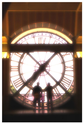
The picture on this post has a hot link going to the International links. There is a link on the lower part of the image that goes to the image credits.
The previous/next buttons make the site reviews a bit more blog-like as it is now possible to navigate through all of the reviews just by clicking the arrows.

No comments:
Post a Comment